
Tracking Project Explainer 2025-26

I have now reached a satisfactory state of completeness with respect to my automatic PxP and tracked data joining → chart making pipeline that I feel we’re in a great place to start the season. As such, it is perhaps time to explain everything so that we have this document to refer to when any questions arise. Some of these definitions aren’t explicitly common, so it’s important we’re all starting from the same page.

Here is last years explainer, many of the same concepts apply but it might be a useful consultation just to see how far we’ve come. Unfortunately, I won’t be offering the same annotation this year as it’s just much easier to work within DataWrapper’s GUI based system than R’s but I think we’ll be okay.
I’ll start with a glossary and then take things graph by graph to expound on whatever aspects need it.
Glossary
Expected Goal (xG) (Shot): probability that this shot becomes a goal based on historical shot information
Expected Primary Assist (xA1) (Setup): the primary setup leading to a shot, previously this was all passes, now it also includes actions that lead to another shot like a shot that leads to a rebound or a blocked shot that leads to a shot
Expected Primary Points (xP1) (Contribution) : the combination of expected goals and expected primary assists that a player was responsible for. referred to as shot contributions it is a bucket designed to capture a players’ shots and setups in one word
Rush: the offense created in the immediate aftermath of a controlled zone entry, or the situation when a player carries or passes the puck over the blue line, not limited to a rigid second but moreso focused on the state of the defense
Coverage Exit: When the team in the defensive zone recovers a loose puck and transitions it with possession out of their zone
Set Breakout: when a team stations behind their net, usually on line changes, and exits the zone with a set-play
Dump-in Retrieval: offense that originates from a player retrieving an intentionally dumped-puck and creating transition offense
Defensive Zone Counter: quick strike offense from manufactured turnovers or shot blocks that result in instant and usually dangerous rush offense
Defensive Zone Faceoff: offense that comes from a won defensive zone faceoff and is quickly turned into transition and rush offense, at risk of being combined with Coverage Exit since it’s mostly rare and is about the same conditions
Deep Regroup: a slower type of rush offense where the puck is intentionally carried back, either across the red or own blue line, before reorganizing and attacking the blue line
Neutral Zone Re-entry: a quick strike type of offense that comes from a gathered loose puck or forced uncontrolled exit. Similar to Deep Regroups but substantially more direct, usually when the puck doesn’t cross the red-line
Neutral Zone Counter: quick-strike offense from a created turnover in the neutral zone or in the process of entering the zone
Neutral Zone Faceoff: self explanatory, also at risk of being combined with a sort of “battle win” offense that doesn’t fit neatly into the above categories
Forecheck: the offense created in the immediate aftermath of a giveaway, takeaway or loose puck recovery as a result of a dumped puck or non-controlled zone entry
Exit: when the takeaway happens when the opposition team has established possession and is making moves to exit the zone
Retrieval: offense in the immediate aftermath of a failed retrieval on or around the recovering teams’ first touch or before they firmly establish possession, this can include loose pucks chipped into the defensive zone that haven’t made it to the back wall, the key is in the contest for possession
Clean Recovery: the offense in the immediate aftermath of a hard-rim or otherwise indirect pass into the zone that is recovered by the dump-in team without a retrieving team coming near it
In-Zone: the bucket of all offense that comes when possession originates in the offensive zone, this includes faceoffs, saved-shot recoveries, cycles and otherwise.
Shot Recovery: any time a loose-puck is recovered by the offensive team, whether cleanly or through contested wall battles, this could be an intercepted pass that was turned into a loose puck or more commonly a shot that was saved by the goaltender
Faceoff: offense immediately after a faceoff or where it was the origination of possession for a sequence that extends after a faceoff without interruption
Delayed Rush: offense that comes from a controlled zone entry but is slow enough to allow the defense to have fully set in their coverage structure
Delayed Forecheck: similar to Delayed Rush but typically an extended possession where the defensive team lost a dump-in or were thwarted on exit but still had plenty of time to recover to a solid defensive shape
Shot Types: a variety of different styles of shot, mostly based on how they arrived to the shooter and not considering the style of shot (i.e. wrist, snap, backhand, etc).
Off-Pass: shots made where the shooter was directly played into the space they ultimately shot from, allowing some time between the pass and shot should the shooter be utilizing hesitation moves or not otherwise upgrade the location
Walk-in: shots that come from passes but where the pass happened an extended time before the shot or the shooter upgraded the location in a significant way
Rebound: a shot that comes directly from a goaltender save and the shooter displays some intention to put the puck in a scoring location
Putback: similar to a rebound but without scoring intention, highly subjective and intended to capture pad-stuffs and other opportunities without trying to intentionally beat the goaltender
Tip/Deflection: shots that are re-directed onto the net without a shooting action. This likely also includes shots deflected off-bodies to save space.
Loose-Puck: a shot where the puck was loose before shooting, this can feel like a rebound if the previous shot was blocked but can also come from missed shots that bounce off the boards or takeaways that weren’t explicitly passed
Bigger Picture Explainer
Unfortunately, none of the following charts will be interactive. In moving away from Excel and DataWrapper and joining my tracked data with NHL PxP through automatic means, I have sacrificed this aspect from day-to-day reporting.
It is my intention to, eventually, bring this functionality back via some sort of Shiny webapp (though it looks like Plotly is being deprecated so very much TBD on that), which would be especially useful in terms of sifting through the various shot and/or shift evaluation parameters, but that’s later down the road. It is, for now, outside my means considering I gave myself two months to learn how to do all of this. I still have a ton of streamlining to do on dataflow and/or chart making process outside of incorporating more aspects of the tracking.
I will likely continue to use DataWrapper’s interactivity for some of the bigger picture Armchair GMing but that doesn’t have direct implications with this tracking project specifically.

If you want to understand some of the whys in the upgrades and some of the objectives in making the graphs day-to-day, check this out! It also features some explanations on the cool new colorways I’ll be used to make the data more readable and more accessible (and explaining why I’m moving away from CBJ colorways as fun as they are).
Time On Ice and Game Situations
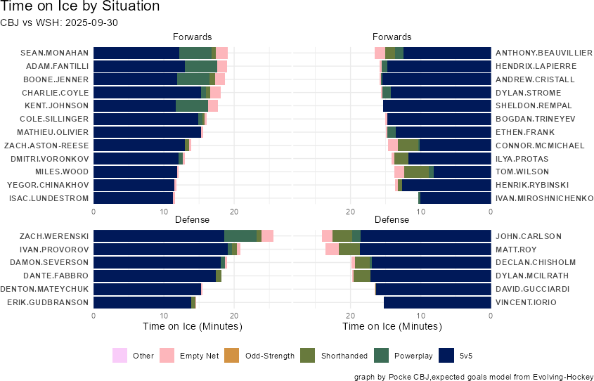
This graph is pretty straightforward. It is intended to give us a quick overview of how much each player played and at what “game strength state”. These states, detailed in the key beneath the plot are fairly intuitive but not really commonly broken out this way.
5v5
The most common game-strength-state and often the most studied one. Breaking it out specifically is preferable to me for a couple of reasons but the biggest reason is simply because it’s the most voluminous and most “even'“.
5v5 are where the bulk of coaching tactics lie and if we’re to move towards understanding them we have to take these situations separately.
Powerplay and Shorthanded
The next biggest situation at least relative to coaching tactics lies in these two special teams states. They are inverses of eachother and I don’t think I need to explain too much here. They are explicitly the special states that occur as the result of a penalty.
I am tracking all of these minutes which should help us get a better idea of how these game-states interact to determine an overall game outcome. Similarly, it might explain some deployment tendencies, like the above where the Blue Jackets’ top powerplay saw reduced 5v5 time but that was compensated for by a ton of PP time.
Odd-Strength
This is, perhaps, the strength-state that needs the most explaining. It’s a play-on-words for “even-strength”, indicating that both teams have an equal number of players on the ice, but intended to be more specifically the times where the number of skaters are even but in unusually occurring states like 4v4 and 3v3. This will include all overtime.
I have broken these out separately because while they are certainly representations of skill against opponents and in equal situations, they aren’t necessarily tactical and therefore should be considered separately for those purposes.
Similarly, I have avoided using “even-strength” because there are a variety of definitions. This is sometimes used to include the time when players on the ice are even (as in 6v6 or 5v5 or 4v4) without worrying about whether or not one of them is a goalie. In this case, it’s only whatever-combination of forwards and defensemen that are even.
Empty Net
This situation is the most obvious but has a little bit of nuance. Most commonly, this describes offense at the end of games when the goalie is pulled for an extra skater. In my case, it also describes shots taken in delayed penalties once the goalie has left the ice.
There is an unfortunately negative interaction for the overall game because I have chosen to forgo shots taken outside of the offensive zone. Largely, these are not significant shots but, sometimes, they can be especially if said shots come on an empty net.
Perhaps this is something I’ll simply have to concede on in empty net situations exclusively.
Expected Goals and Expected Primary Assists
The next and perhaps most significant departure from last years tracking project is the move toward Expected Goals. Ideally, I’d love to offer both this more advanced metric alongside older metrics like “chances” or “high danger chances” but it would result in simply too many graphs to tell perhaps the same stories on a game-to-game basis. Perhaps a more sophisticated method would be to retain both and plot them together but that will remain a project for another time.
Worry not, I will still have the capacity to break out shot attempts or changes should this information prove useful in later analysis.
To get to the point here, I thought I’d offer a couple of sentences on what exactly an Expected Goal is and why measuring who passed them is important.
What is an Expected Goal?
At it’s simplest, an expected goal (xG) is the probability between 0 and 1 that this specific shot turns into a goal. An expected goal value of 1 means that this shot was guaranteed to be a goal, this is unlikely to ever happen.
So, how do we expect them? The simplest answer here is that we track a couple of factors, most significantly shot location but also the time since the last event (like a takeaway or a rebound), look through the history of shots taken from similar situations, determine how many of those shots turned into goals and then assign the probability that this one turns into a goal (or it’s xG value).
This information is generally agnostic of the player taking the shot, so it’s best assumed that an expected goal is the probability of an average shooter with average pre-shot movement. This is not a mistake and not a reason to discredit this statistical invention, it’s done with a purpose, but it is something we should be aware of when reading the data.
While we know that a Patrik Laine or Yegor Chinakhov shot should be more likely to result in a goal than Sean Kuraly, and should perhaps be weighted differently, that’s something we can determine by looking at how many more actual goals they score than “expected”. Certain websites will choose to display just this type of shots, called Shooting-Talent Adjusted Expected Goals.
It’s absolutely not a perfect metric but it’s much closer than anything else we have and it gets points for being easy to translate to how results are differing from performance. If a player has 20 xG but 40 actual goals we could say they were “lucky” or we could say they “finished their chances well” or we could use some extra information and eye-test to say something like “they’re an elite finisher and we can expect that to continue more or less”. That specific example is very exaggerated but we can look at Tage Thompson as an example.
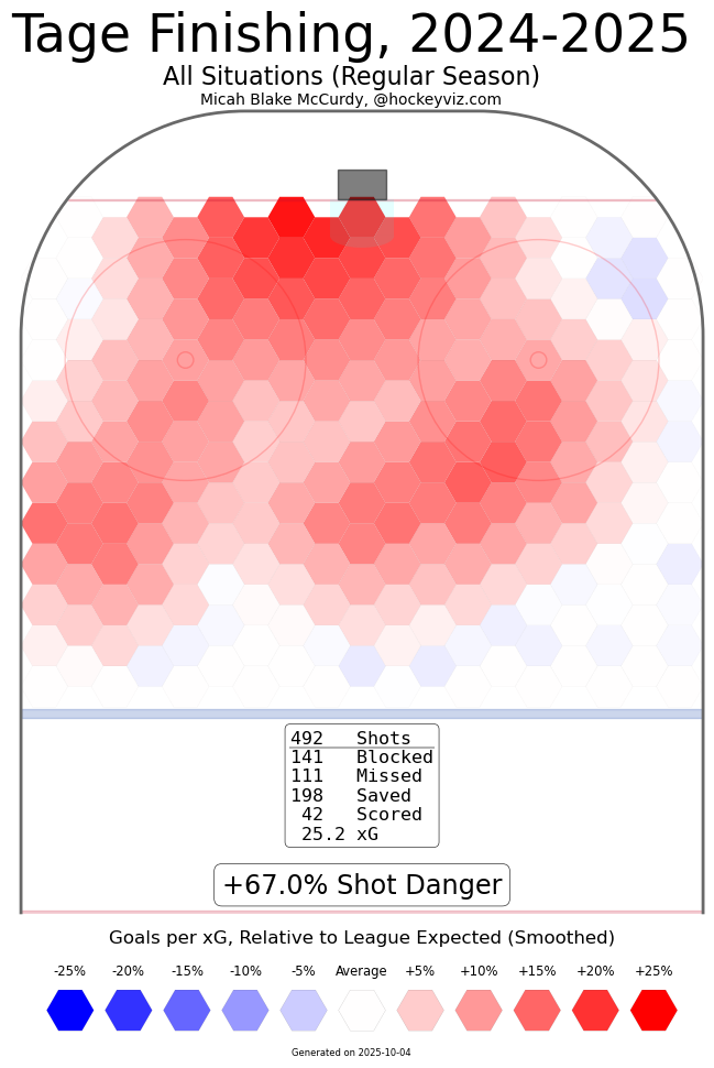
Tage, who has all-world scoring ability, scored 42 goals on 25.2 xG. Will he always score close to double above his xG? Maybe, maybe not, but we’re safe using some external context to say that he’s probably going to keep scoring more than expected.
Expected Primary Assists or xA1
So, then, what is an Expected Primary Assist and why does it matter? Simply put, it’s the person who passed the puck to the shooter or the person who would be credited with a primary assist should that shot have turned into a goal.
These are technically different things because of shots that lead to rebounds, shots that are tipped and shots that are blocked and end up loose that another player shoots.
I’ll get more into those specific situations later but it’s important to express that not all passes are created equal. For the most part, I don’t discriminate and assign credit to any player who passed the puck. There is plenty of signal in whether or not a shot came from continuous possession.
The only exception to this rule is passes outside of the offensive zone without pressure. A set breakout where a defensemen hands the puck off shouldn’t count if it said puck carrier takes it coast to coast. I suppose if this happens and they score, I’ll technically have numbers that differ from official scorekeeping but that’s just a problem we’ll have to accept.
The definition of “pressure” is a bit subjective but typically a pass is considered “pressured” if there are two opposition players in the same zone or one within reach of the player making the pass. These are more guidelines than hard and fast rules, I think we generally know when a defensive zone pass is pressured.
The Why for Expected Primary Points
I suppose I should mention here that I am only recording one setup for reach shot. Secondary assists will not appear in my data. As much as I’d like to track every single pass and puck touch made, I am simply one person who doesn’t want to spend all my time creating data.
The importance of creating this information, however, is significant and was discovered by work done on Hockey-Graphs by Ryan Stimson. The full writeup is linked above, feel free to read it if you’d like. Essentially, 5v5 Expected Primary Points/60 are a better predictor of future Primary Points/60 than any other metric we have. So to that point, I’m going to track them.
To this point, I believe I am making a departure from this specific research when I track plays that lead to rebound setups. Stimson, as far as I can tell, only researched shot assists and I don’t see anywhere where he included rebounds.
More on that in a bit but it’s important to caveat this because my tracked research won’t be directly applicable until I have enough data to ascertain how each variable affects predictive quality.
The Purposes of the Charts
These charts are designed for a couple of specific purposes but mostly they serve as tools to visualize the overwhelming information in a hockey game.
To that point, they are to be used to help signpost events/situations/players/tactics that help explain the how/why. They are intended to guide our attention to these performances so that we may look deeper. To that end, my intention is to utilize the data and these charts to signpost areas that I will then dive deeper into with film.
This doesn’t mean they are useless on their own, the data is still good, but they aren’t the end-all-be all either. They should be used as starting points or as supplements to the wealth of information and context that our eyes collect at the same time. Single-game outcomes can be very volatile, especially in stats, and there are plenty of things “not-measured” that are still valuable.
There are plenty of challenges in displaying the same data across games, where certain events may or may not happen, without accidentally warping our perception with changing axes or column/bar widths and sizes. Essentially, I’m making sacrifices to limit at-a-glance mistakes.
The first is that all player charts will have a limit of 1 xP1 and any extra will extend off the plot. In order to keep the data in-line across the “micro-plots” that make up the bigger totals, I had to have consistent axes and this is the best way to do it for now.
The second is that all players will be ordered by their time-on-ice (TOI) in a given situation. There will be specific situations where players are grouped by their general line assignments but within those they will also be ordered by situation specific TOI.
In some of the graphs displayed today, which are varying levels of rough drafts, that might not be true. Some are sorted by shift-quantity, which may be a better representation than TOI from a coaches perspective, but moving forward I think arrangement by TOI is the most appropriate to achieve the goals.
Player xPrimary Points Data
To this point, I will be graphing a variety of Expected Goals, in this case shot, and Expected Primary Assists, setup, information. While the above graph is All-Situations, I will also bring 5v5 and even Special Teams information to the table separately.
It’s important to note that charts where xG and xA1 are both plotted, from the perspective of the player, have a tendency to exaggerate outcomes on the whole picture. These shouldn’t necessarily be used to say which lines/did well but making sure to reward a player based on all of their contributions rather than assigning credit to only the shooter.
Furthermore, the chart has a hard-stop at 1 xP1. Any contributions above one will not be measured. If a player contributed that amount, it’s safe to say they had a significant impact on the game and their performance merits looking more into.
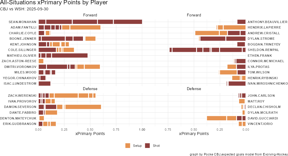
The above graph is xP1 contributions by type, whether it was a setup or a pass. Not much to explain on this one but it can help point us to playmakers vs shooters.
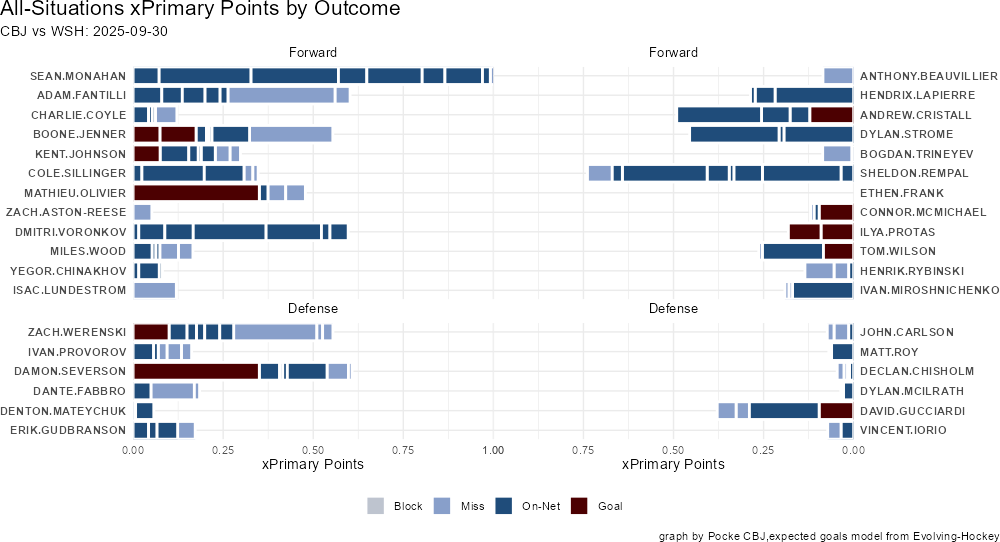
Here outcomes are plotted with the shot outcome in special colors. If a shot was scored, it’s red, which means these are either shots or primary assists.
Critically, you might notice blocks are a grey rather than blue and that they don’t appear. The NHL does not publish the locations of shots that were ultimately blocked, only where the block occured. Evolving Hockey does not publish predicted goals values for blocked shots and therefore there isn’t any information at the current moment.
I am tracking relative bin of shot location, so with some time and effort it’s possible to apply relative xG values of blocked shots. Whether or not this is a good idea is yet to be determined, though Micah at HockeyViz has some techniques to estimate their value, but for now blocks will be given a placeholder legend.
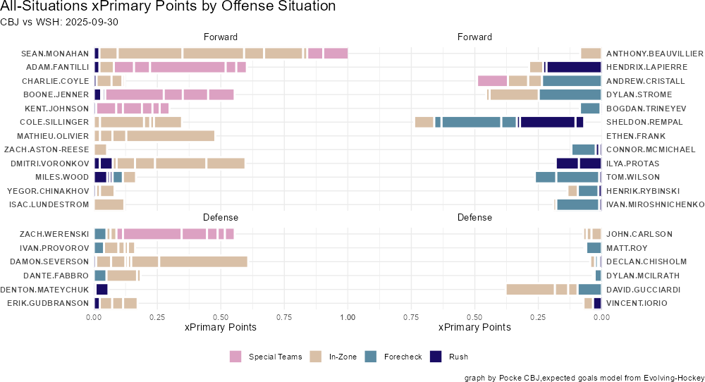
This chart displays which situations each player created their offense in. In-Zone, Forecheck and Rush are all at 5v5 and Special Teams includes the rest of all offense situations (Powerplay, Shorthanded, Odd-Situations and Empty Nets).
The bins, such as they are, are not indended to describe every situation but to signpost us toward which areas to explore further. In this case, CBJ’s in-zone and powerplay contributions and Washington’s Forecheck (perhaps related with CBJ’s lack of rush offense).
You might notice a “blank space” on Sheldon Rempal’s contribution bar, this is because I didn’t have a tracked shot that corresponded with NHL PxP’s and therefore didn’t have an offense situation either. While I hope to avoid these in the future, and already do plenty of correction, there’s definitely going to be some error on both sides.
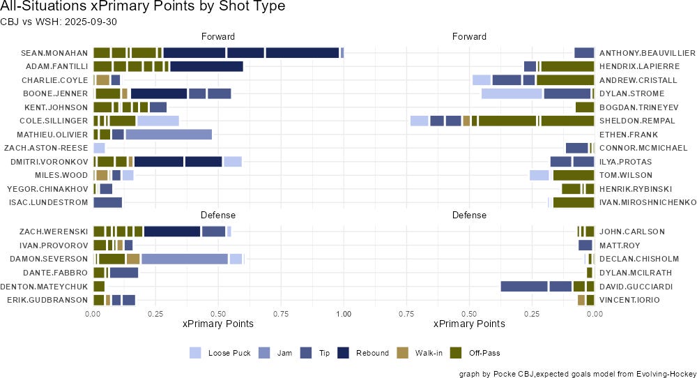
The last player graph for all-situations offense is by the new shot-type metric. The same goes for above, the glossary has all the pertinent definitions.
For example, we can see that Sean Monahan created his enormous amount of offense off of primarily rebounds! To be expected with large values but it looks like Severson assisted on Olivier’s large “jam”, and we know from previous graphs that it resulted in a goal.
On-Ice xG For and Against
One of the more frustrating aspects of spending so much time tracking games is that it moves us toward understanding offense better, by incorporating passing and hopefully even more by incorporating the new shot types and situations, but we already have plenty of ways to describe offense. Everyone already cites points.
Largely, that’s fine. Offensive metrics are more likely to be within the control of individual players, and are more likely to be repeated year-over-year, than defensive metrics, at least as far as we can tell right now. Still, no reason for us not to look closer and see what we find.
The benefit of associating the tracking with NHL PxP, painful though it may be, is also that I have every skater who was on-ice for any given event. This moves us slightly toward understanding some possession/control or maybe even defensive metrics.
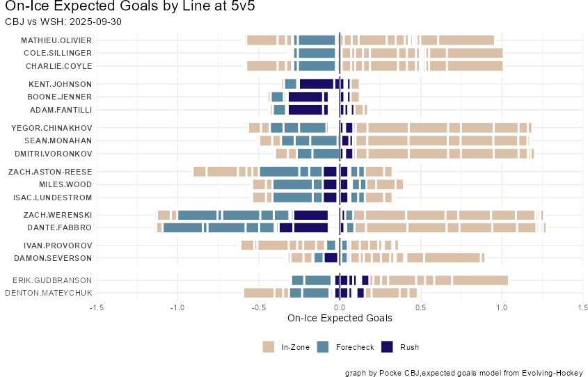
The above graph includes chances that each player was on-ice against as well as the chances they were on-ice for without regard for whether or not they specifically contributed on them. The left, or the negative numbers, is the offense that the opposition team created while that player was on the ice.
To put it in a concrete example: Zach Werenski and Dante Fabbro were on the ice for most of the Washington Capital’s forecheck chances at 5v5 and even a big rush chance.
Plotting these by situation, and perhaps later shot-type, might help us learn a little more about the types of chances that each line/combination gives up. Notice that each player is associated with their most common line at 5v5. In this case, they are not organized by TOI within lines but that’s an optimization I hope to have soon.
Should the coach blend the lines in the third period, or whenever, the groupings will conform to whichever line was played together the most but each individual’s bar reflects what happened the entire time they were on-ice and not just when they were with said linemates. Notice the different between Severson and Provorov.
No, I have no idea why Gudbranson and Mateychuk aren’t being bolded, hopefully something to be worked out shortly.
Team Level Data
Though many of the previous charts focus on the players, we have to be careful about using those in determining “how the game went” primarily because of double-counting certain shots.
When it comes to evaluating teams that means we must use exclusively shot information without passes. While we lose some quality information in not knowing passes that’s an unfortunately limitation of the lack of data and passing. The best way to do this, as you would see with a “Private Model” would be to include the passes in how they upgrade the danger of each shot.
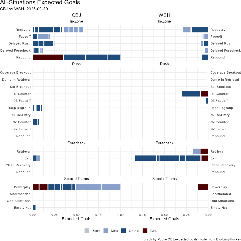
I consider this graph to be the “Birds Eye” view of how the game went. It covers all important tactical situations at 5v5 and breaks out the Special Teams into their more distinct and appropriate categories as well.
In all likelihood, I may end up trimming some of the more rare rush situations, or binning them, but for now we hold space for their potential.
The “story of the game”, at least from this perspective, appears quite clear. Lots of forecheck exit offense from Washington, lots of in-zone play from CBJ and a pretty good powerplay.
The Rest
For now, this is more or less the total chart package I’ll be bringing into the season. While I may pull out more specific situations so we can look for extra detail, those graphs will be more or less the same structure. It maybe be a single player over all the offensive situations instead of the whole team or it may be a single game situation with more information as well.
As I continue to develop and refine these charts through the season, I’ll write their explainers separately and likely edit this document with links to them down here so that we can have everything in one place. The downside of hijacking Substack instead of building a full website means I can’t just put them in their own little explainer section.
There are, largely, a huge host of annotation upgrades that I already have planned and charts I’d like to incorporate quickly. Ideally, I can add actual numbers to the ends of each of these graphs so that the bars that extend outside of the range aren’t lost.
If you have any feedback or suggestions, the sizes of the graph are largely my best guess at finding the sweetspot for whatever medium they exist in, whether on mobile, substack, desktop or whatever various social medias.
This is going to be a continued work-in-progress but I’m already very excited by where these already land from a data-driven-storytelling perspective.