
Explaining the Philosophy Behind Some Tracking Project Upgrades
With Some Rough Draft Tracking Graph Previews

I’ve spent the last month or two, however long it’s been since I published the Mateychuk breakdown, learning how to use R for data management, statistical analysis and graph making primarily so that I can improve the tracking project and develop some of my own skills. I am now pleased to share the first look at some of the rewards of that work.
At some point before the season starts, I’ll write up definitions and graph/chart explainers for this next wave of the tracking project. I will be tracking more information, including shot type, shot and pass locations via location bin based on NHL Edge (primarily to examine whether including blocks and what value they should have helps improve xG models) and expanding the tracking project outside of 5v5 play.
While I initially sought to determine the tactical differences between teams via analysis of each “offense situation” as it relates to the systems and players of each team, and though I have not accomplished that task nor even progressed in any true analytical sense, I think there’s room to do incorporate a little more.
I think including some of the non-5v5 information is a way to bring more eyes to contributions on special teams, which I am specifically interested in doing on the powerplay because of its increasing importance to success. This way, we aren’t limited to just what happened during certain phases of the game but can see how each phase compares in importance on any given night.
The big picture is that I’ll be integrating my hand-tracked data with the NHL PxP primarily through the painstaking process of manually adjusting the shooter and game-second of occurrence just after each game ends.
This does have implications on when I can publish the data, given that the tracking will take more time (more data points tracked) with fewer breaks (can’t skip special teams or empty nets), and I’m not sure whether or not this additional information and data is a good thing.
I’m very excited about the changes but I’m nervous that publishing them later or the next day removes them from some of their purpose, will lose some of the post-game eyeballs and takes extra time from my already limited bandwidth. Furthermore, I’m worried that moving away from 5v5 is also a poor deployment of the limited time resource but I’ll perhaps cover all of these concerns at another time.
For now, I’ll talk a bit about the “what” and “why” of the new things without going into the full definitional detail. The “post game chart” development process is likely to continue through the year as I refine my methods, develop the data pipeline and graph making code and learn more about what is important to understand from each game.
On-Ice Players
The first innovation from ceding final shot authority to the NHL shot trackers and joining the time to agree with the NHL PxP is that I will have access to the players that were on-ice during the shot.
My intention as part of the tracking project last year, and recording each second of each of these shots, was to incorporate this information over the summer. After taking a quick look at it for a single game, I came to the conclusion that this was impossible. I simply disagreed with NHL shot trackers too much and there wasn’t a consistent error that would be correctable.
For example, if I disagreed that a shot was tipped, I would also disagree which player took the final shot. If that tipped shot was rebounded, and my shot-time adjudication off by a second in the wrong direction, I could think I was talking about this second shot instead of the first.
To that point, I wasn’t able to come up with some of these metrics from the wealth of data I had last season because I would have had to manually correct each shot to make sure it lines up in time with NHL PxP. That’s alright but it also has implications on the project moving forward. Essentially, I have to make sure each of my tracked inputs aligns with NHL PxP.
This means, ideally, that we don’t have to think about players by exclusively their offensive contributions and can move toward understanding how they contribute as a function of lines, teammates and opposition.
I don’t like only highlighting what each player does on the puck, though passing information is absolutely critical and more people need to see it, and theoretically I can use some extra tools and analytical power to determine on-ice impacts of different styles and perhaps even defensive contributions as the inverse.
Goal 1: Tracking and Demystifying Expected Goals
I can now, thanks to the NHL scraper from Evolving-Hockey, append an expected goal value to each shot taken. This is very exciting for a few reasons but is also the primary constraint in terms of event-matching.
If I were to disagree with a shot tracked as “tipped” or taken in some other way, especially by player, I would be fundamentally altering the shot properties that lead to a certain xG value. The difference between a “tipped” shot and a point shot is tremendous.
This issue will persist until I hand-track all locations, which is conceptually possible given tools, and then also build an xG model that will automatically assign these values. The problem, then, would be in merging proprietary information with PxP players-on-ice, though that’s not conceptually difficult.
Before I digress, I suppose I can talk a little bit about why utilizing xG is a good thing. For the most part, it’s preferable simply because it reduces the dimensions I have to chart. It is, at least at a conceptual understanding, better than shots and chances because it clearly explains what it is. 2.5 expected goals when 6 were scored is easy to understand relative to 6 goals on 16 chances.
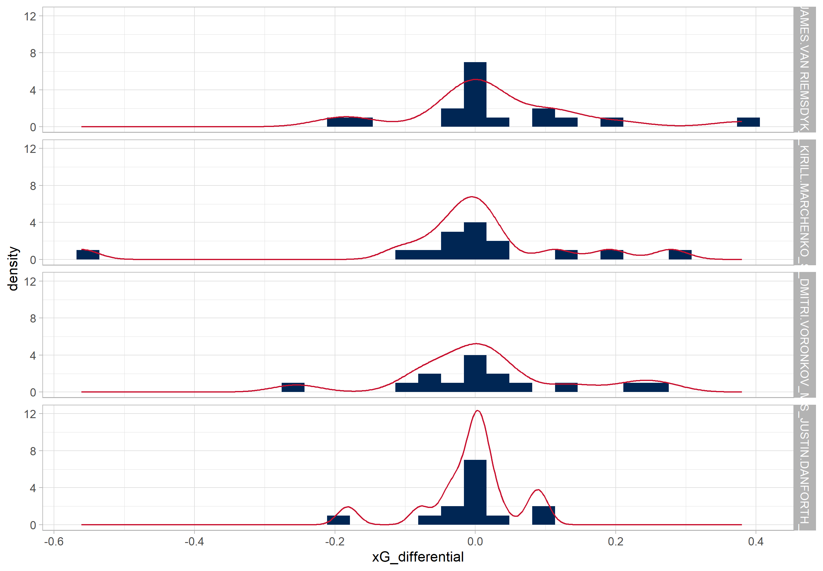
In the preliminary graph used to evaluate the last game of the season from 2024-2025, shot outcomes start to make a lot more sense. This a rough draft, plenty of changes to come and be explained hopefully before the season starts.
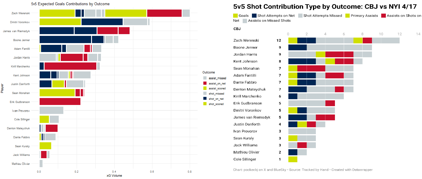
(apologies for the visual artifacting and non-size fits these were not designed for the purpose of comparing them side by side)
Each of the “segments” of the bars on the left indicate the xG value of a single shot attempt (technically it’s unblocked shot attempt as blocks don’t have estimated xG values in Evolving-Hockey) whereas the segments on the right, though they aren’t delineated with a white border, each indicate a single shot attempt.
On the right, we’re left with a bit of mystery as to the quality of chances that Werenski scored on. On the left, it looks like those chances are explained well simply because those are some of the biggest chances that Werenski took part in. We can perhaps also say that Boone Jenner was “unlucky” not to have scored on that really big one and it looks a lot like Kirill Marchenko was the one that passed it to him.
This points to the next critical factor: xA1. These are also known as primary expected assists and this helps us understand the danger created just after a players’ passes. In the original work on the subject, Ryan Stimson found that xA1 were more predictive of future offense than simple shot assists.
By having xA1, we’ll have a real number with which to compare actual outcomes that is more useful than “ranking by chances” and is easier to translate into projected future outcomes than abstracted metrics like “high danger passes” or “chance assists”.
Futhermore, I’ll eventually be able to display such Mitch Brown metrics like xP1%, or the proportion of on-ice expected goals that a single player either shot or passed, and might even be able to build from there.
The hope is that these graphs and sequences will help make xG feel a bit more “real” or substantial or at least natural and, if failing all of the rest, at least simply more familiar. I think there’s an air about xG that makes them intimidating and simply spending more time with them day-to-day might help clear some of that mystery haze.
I have some skepticism about the utility of xG when talking about single game outcomes (two wolves, more on it below) but I find the benefits of having to make fewer graphs, and enabling more layering of information, to be far worth the tradeoff. For example, instead of having to soft filter "non-chance shots” by making them grey and therefor de-ranking them visually, they will instead be accurately represented via size and therefore have less influence on our “at-a-glance” understanding of how a player created offense in each game situation.
Goal 2: Move Toward Passing Value Added or Pre-Shot Movement
One of the major criticisms, or perhaps next avenues for improvement, of expected goals usage is their lack of including critical pre-shot information. Essentially, expected goals are heavily influenced by a few factors which are limited by what the NHL publishes. Mostly, they are simply cataloging how close to the goalie a shot came from.
Since I will be utilizing Evolving-Hockey’s xG model until further notice, here is a link to their full write-up. I should probably just write up a full explainer when I detail definitions, but I’ll offer a quick synopsis here as well.
Here are the factors by their importance to the ultimate value of an “expected goal” and come completely without tracking team-possession. The NHL PxP publishes shots, blocks, misses, etc but mostly only takeaways and giveaways otherwise. Time since last event is not time since last pass but instead one of the above and therefore these models are kept pretty far in the dark. That isn’t to say they are bad at all but there certainly not as good as they could be and they also can’t tell us about the quality of playmaking.
I may, eventually, find a sort of hand-crafted “chances” that includes some aspect of xG-upgraded-by-passing. To that point, I am tracking both shot and pass location “bins” as a sort of shorthand for finding “high danger” passes and even tracking, more or less, the time-to-release of the puck as it relates to “pre-shot” information.
I will not be utilizing the pre-shot passing and shooting bins to start, and it might be quite some time before I really find the use case for that information outside of “graphing” but it will indeed be there.
Here, I want to emphasize that xA1 doesn’t necessarily mean that a player “created” or “was responsible for” that degree of an on-ice xG. It doesn’t not mean it other but that’s a deep philosophical rabbit hole I’m not quite ready for yet.
Conceptually, pre-shot information and the degree to which a pass upgrades a shot could be attributed more to the passer than shooter. Furthermore, on-ice team xG could be influence by passing and incorporate the skill relative to the on-ice events. Right now, including xA1 as an “on-ice metric” would be accidentally “double-counting” every shot that happened on the ice.
If we can incorporate “xG improvement by passing” we can effectively evaluate whole teams, let alone just single players, by how well they pass on the ice. That’s a future metric and not one that will be captured unless I can get a lot more data.
The other “problem” here is that blocks are recorded differently by the NHL and only at the location of the block. This means that a point shot that is blocked by an opponents’ body near the net is graded as the same as a slot shot blocked by a defender in the same location. For that matter, most xG models ignore blocks. By tracking shot location in “bins” I could theoretically add xG values for blocked shots based on some of that historical performance. Micah Blake McCurdy has found a technique to do it, and the data I’m tracking is perilously small relative to most models, but perhaps it’s possible.
Goal 3: Rebounds/Chaos vs Controlled Offense
The primary purpose of breaking shots out into “type buckets” is to take a look, game-by-game, a bit deeper at the quality of chances. One of the reasons I felt hesitant to use Expected Goals for single game outcomes was because certain events, like tips and rebounds, often had an outsize effect on xG quantity and weren’t necessarily reflective of “who was winning” the share of chances in the game.
What I found, ultimately, was that even “low-quality” rebound or pad-stuff attempts resulted in goals more than most other attempts that I tracked last season.
What gives me pause again, or at least signposts these events as requiring further study, is that certain public model builders find their game-prediction models to be worse if there is a parameter for rebounded shots.
Both HockeySkytte and HockeyViz removed rebound parameters for danger in their models because they didn’t improve the outcomes in a satisfactory way.
The idea, at least I think, is that these models were made less-predictive if rebounds were “compensated for”, usually by increasing their danger value, despite so many goals coming from exactly these situations. Corey Sznajder said it best in his breakdown on non-rush goals but that one is worth reading too as it relates to the Florida Panthers:
This is where I start to wonder if we’re measuring skill or just “stuff that happens.” We’ve seen players who are great at getting deflections in front of the net & it’s more of a part of the game now, but they’re still low-occurring events in the grand scheme. Just from the feast-or-famine nature of them.
Perhaps this could be another breakdown entirely but I suspect we’re heading towards “agency” in offensive creation. Said differently, perhaps the best players in the game are the best players because they can reliably create certain kinds of offense and perhaps that type of offense is best executed off-the-rush.
It’s easy to understand, at the base level, why creating offense through controlled play is repeatable. The player carried the puck and moved around the defense and then they made a play to a player who shot it. Everything was within their control or, at least, reasonably within their control.
With a rebound, or a tip or a deflection or a puck picked up from a block, the puck landing on a players’ stick doesn’t seem as likely to happen. Plenty of players crash the net but goalies know that too and they don’t want to let those players get those pucks. To some extent, whether a player gets to an available rebound, or even whether a rebound is available, is up to the other team as much as it is to the offensive team.
Perhaps, then, certain types of offense, or shots, are more “repeatable” than others. At the same time, maybe certain players are that good at getting to rebounds and we shouldn’t dismiss those players either. Perhaps we need to view players longitudinally instead of washing out talent with “averaging”.
It’s likely that only really good players get to create rush offense with regularity partly because of their ability to create the conditions prior, to weave through defenses or draw pressure and beat it, whereas not-good players turn the puck over or dump it in prior to a rush chance. Thus rush chances are a good shorthand for a lot of other things that also mean “skill”.
There’s something else to be said about the increasing importance of counterattacking, and it’s difference in the playoffs, but I’ll have to save that for another time as well. Corey Sznajder’s above work is critical to this point but check out this new one from Aaron Knodell at the same time.
The flip side of that coin is that “rebounds” are more democratized. Both good and bad players get to rebounds, perhaps even weighted the other direction. Bad players just go to the net and whack at pucks, good players can score without rebounds, make plays off of rebounds, or act through chaos by finding exposed net in these intense situations and therefore score more efficiently on said rebounds. By averaging them all together, we might be losing some critical fidelity that might not be present in similar comparisons of “rush” offense.
Or, maybe not. Perhaps they are simply more chaotic, require reactions too fast for skill expression, are less repeatable and not really a skill but instead part of hockey’s volatile variance. That would mean a factor for rebounds is tracking something that decides games but isn’t reflective of “team quality” and therefore reduces predictability.
(These are two more wolves competing for game analysis. What decided “this game” vs what “bodes well for a team in the future”).
To wit, I’m pulling a little from Darryl Belfry and Mitch Brown here to help delineate shot types more than just “rebound” and “open play”. Belfry often espoused that the best goal scorers score “off the pass” when compared with “extended carries”. Mitch Brown, in his “expanded offense” playercards neatly delineates both shots and passes that lead to immediate shots or those that require carries to turn into shots.
To that end, I’ll be providing us with some “shot type” classifiers and we’ll see what we see! I don’t want to explicitly say one is better or worse, though it seems like “off-pass” chances are classifiers for better types of offense, but simply to highlight which one is happening so maybe we can move toward more rigorous evaluation in the future.
To that point, last season I didn’t track “shots that lead to rebounds” as “shot assists”. I suppose I’ll speak more on this later whenever I write up the actual definitions but I think it’s going to be important to determine what actually counts as a “shot assist” vs what is interfered with by the other team. To that extent, I won’t necessarily be calling these events “shot assists” anymore but “setups” (though they’ll be referred to more often as xA1) to indicate that they don’t necessarily come from passes.
Since players will get credit from the NHL for primary assists from rebounds or blocked shots that lead to teammate goals, I may as well also add them to each underlying shot attempt. Before, I didn’t want to “double count” a rebound assist that resulted from an actual shot when considering an individual player but at least by separating out the “type” we’ll have some method of distinguishing these occurrences.
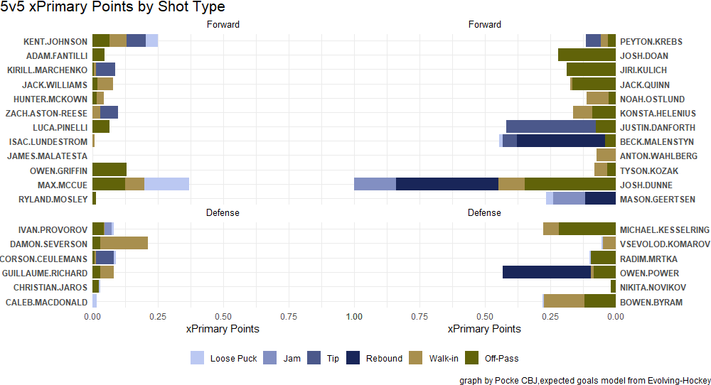
Above is more or less the method of information dissemination I have chosen. I’ll get more into the colorways in a second but I really like how the two groups of controlled vs chaos have diverging but distinct colors. Notice that these shot types are binned by total xG of each type and without the “white border” that delineates each shot (as the 5v5 Expected Goals did above).
I also fight the two wolves of “share all the information in one chart and find patterns from there” and “use a bunch of charts but each has an easy to find pattern”. I’m not sure I’ll ever reach a satisfactory point here but the plan is to have drill downs available for deeper dives whenever and to manage visual complexity as well as I can.
Josh Dunne’s performance here (I believe six tracked consecutive high danger/rebound attempts of varying degree) has also inspired a good change in my methodology for applying “shot assists” to rebounds, namely that a player shouldn’t be able to get a shot-assist from their own rebound. Perhaps I should also be “flurry adjusting” when a player creates their own rebound as well but that might have to wait for when/if I can create my own xG model to work from.
Goal 4: Shift Level Analysis and the possibility of “Dead Shifts”
The second aspect that benefits directly from having access to NHL PxP and on-ice players is the capacity to break down the game to the shift and line level.
While we love to lean on the “team-game” heuristic, and the on-ice product is certainly guided by some overarching team principles, the reality is that each game is decided moreso by interactions between lines and defense-pairs, and the players that comprise them, than it is a “team” vs another “team”. Those interactions are decided on the shift level and each is performed under a different but sometimes more or less related matchup context.
I’m getting too far into the weeds again but at the very least I’m very excited to be able to break down the game on a shift level.
I don’t really have a great way to do that yet, or at least haven’t decided on a means of with which I am satisfied, but it will at least provide some information to comb for patterns.
These are also older and very rough drafts, partially because I forgot to download the portion of EH’s scrape data that includes line changes and they don’t keep them around for pre-season games and my next-wave of visual updating was post-tracking of the first preseason game, and partially because I need some more time to think about how exactly I want to attack this specific question.
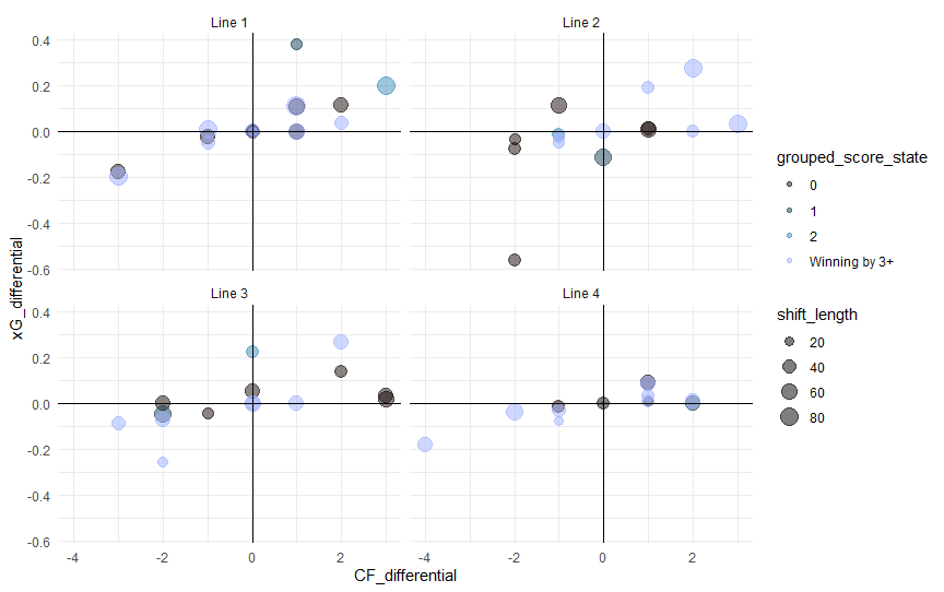
On this graph, I am including specific colors for “grouped score states” because we know that teams play differently when leading or trailing. That way, we can mentally “adjust” how we feel about a certain lines’ performance if a bunch of their poor xG shifts came when they were protecting a lead but also how they performed in a tied game state.
The lines aren’t well described, simply identified, but that is something I’ll have updated going into deployment, so don’t worry about it too much.
I don’t think we should look too much “manual score adjustments” but it is nice to know when a shift looks bad and that’s by the coachs’ design vs when a shift looks bad and it had severe implications on the outcome of a game.
To that extent, that also informs the next research question: are there “dead shifts”? What I mean is, ostensibly, how many shifts does a player play where they aren’t expected to create any offense or otherwise weren’t in a position to. Hockey is very fluid, and we have a wealth of adjustments when looking at an individual across a season, but we don’t have a great way of talking about lines and shifts together at the game level.
Dean Evason, specifically, loves to load up lines with difficult deployment both in competition and zone starts and it would be interesting to know if we should change how we think about certain players if they are given “dead shifts”. Simiarly, this could also have effects on defensemen who are given an outrageous minute deployment and could mean that they, like Zach Werenski (or Quinn Hughes) or Ivan Provorov, should be graded on a bit of a curve. If Zach Werenski’s minutes were bumped up and he got more “dead shifts” than Quinn Hughes, perhaps we should expect a compensatory adjustment in offensive impact.
Off of the top of my head, I can’t really think of a player skillset that would result in any given shift being dramatically less likely to result in shots/goals differential but it would be interesting to keep it in mind through the years’ observations.
Using Scientifically Accurate Colors
In the older above charts, prior to the shift scatterplot, I was using colorways derived from Blue Jackets jerseys. I liked the idea of matching the aesthetics to Blue Jackets colorways primarily because that is my team of choice and I like the idea of spreading that influence. Largely, it was easy to tell the story of whatever data through those colors as they weren’t otherwise complex. As I continue to lean into some of the more complex graphs, differing colors that can help cut through noise make more sense.
Simply put, I was finding that even the red→navy→grey colorway was making certain shot graphs more visually complex, and the gestalt more difficult to understand “at-a-glance,” in a way that I didn’t like. Danger “bins” are easy to graph especially because of how they separated the data but xG graphs are more volatile since xG’s segments will come in a variety of sizes rather than a single regimented unit of “1 shot attempt”.
Here, I present Fabio Crameri’s: Suite of scientific, colour-vision deficiency friendly and perceptually-uniform colour maps that include all readers and significantly reduce visual errors.
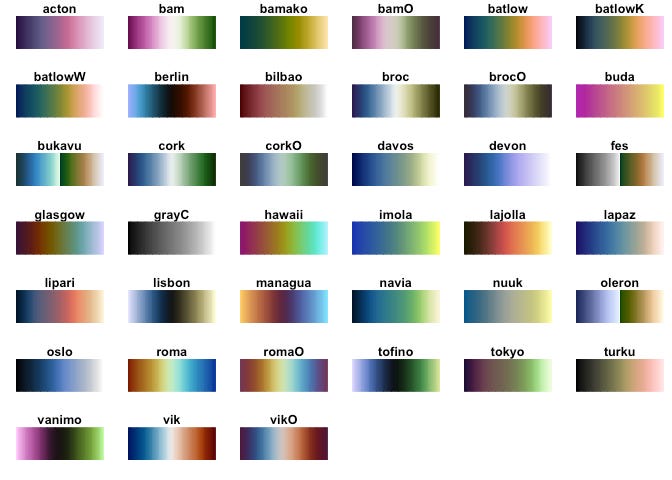
I accessed these using the scico package in R, which helps you pull a large variety of colors depending on your use case and the number you need. This package was made by Thomas Lin Pederson and can be found here.
In creating that “Score State” scatterplot, I came across an interesting dilemma. How do I highlight the differences at the extremes (dramatic winning or losing score states) without de-emphasizing the middle shifts which were also critical to winning hockey games? That lead me on a search for a strange “diverging” colorway but ultimately lead me to discover some excellent research on creating palettes for “scientific” use.
That graph, with special diverging colors, comes from the “berlin” palette, the above “shot type” graph uses the “oleron” double sequential palette and others will use more I’m sure.
If you’d like to read more, Carneri has his publication links in the hyperlink I attached on his name. Suffice to say, this has helped the quick legibility of some of my graphs a ton is certainly an excellent tool in my battle against the two wolves of information density vs graph number.
I think you’re dead-on about rebounds being more luck than skill. I’ve thought perhaps multiple xG models could be applicable for a game. One that’s highly descriptive and can be used for shooting/goaltending talent, and one that’s primarily predictive, with the difference between the two being some kind of measure of how repeatable a team’s performance is.